Frutiger Pro Com Light Italic czcionka
Licencja: Płatny
Autor: Linotype
Języki:
łacina


Informacje o czcionce
Zebraliśmy wszystkie najważniejsze informacje o czcionce Frutiger Pro Com Light Italic. Poniżej znajduje się tabela dotycząca wersji pliku czcionki, licencji, praw autorskich, projektanta i nazwy dostawcy. Informacje są pobierane z pliku czcionki "TTF".
| Nazwa rodziny czcionki | Frutiger Std 46 Light Italic |
| Nazwa czcionki | Frutiger Std 46 Light Italic |
| Nazwa stylu | 46 Light Italic |
| Identyfikator czcionki | com.myfonts.easy.linotype.frutiger.com-46-light-italic.wfkit2.version.3HMN |
| Wersja czcionki | 1.60 |
| Znak towarowy | Frutiger is a trademark of Linotype GmbH registered in the U.S. Patent and Trademark Office and may be registered in certain other jurisdictions. |
| Projektant | Adrian Frutiger |
| Projektant link | http://www.linotype.com/fontdesigners |
| Link do sprzedawcy (dostawcy) | http://www.linotype.com |
| Producent | Linotype GmbH |
| prawa autorskie | Part of the digitally encoded machine readable outline data for producing the Typefaces provided is copyrighted © 1981 - 2009 Linotype GmbH, www.linotype.com. All rights reserved. This software is the property of Linotype GmbH, and may not be reproduced, used, displayed, modified, disclosed or transferred without the express written approval of Linotype GmbH. The digitally encoded machine readable software for producing the Typefaces licensed to you is copyrighted (c) 1988, 1990, 1994 Adobe Systems. All Rights Reserved. This software is the property of Adobe Systems Incorporated and its licensors, and may not be reproduced, used, displayed, modified, disclosed or transferred without the express written approval of Adobe. Frutiger is a trademark of Linotype GmbH registered in the U.S. Patent and Trademark Office and may be registered in certain other jurisdictions. This typeface is original artwork of Adrian Frutiger. The design may be protected in certain jurisdictions. |
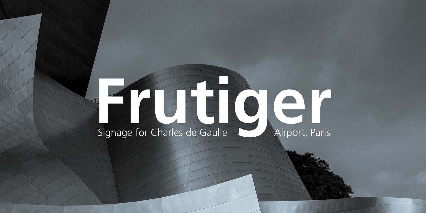
| Opis | In 1968, Adrian Frutiger was commissioned to develop a sign and directional system for the new Charles de Gaulle Airport in Paris. Though everyone thought he would want to use his successful Univers font family, Frutiger decided instead to make a new sans serif typeface that would be suitable for the specific legibility requirements of airport signage: easy recognition from the distances and angles of driving and walking. The resulting font was in accord with the modern architecture of the airport. In 1976, he expanded and completed the family for D. Stempel AG in conjunction with Linotype, and it was named Frutiger. The Frutiger family is neither strictly geometric nor humanistic in construction; its forms are designed so that each individual character is quickly and easily recognized. Such distinctness makes it good for signage and display work. Although it was originally intended for the large scale of an airport, the full family has a warmth and subtlety that have, in recent years, made it popular for the smaller scale of body text in magazines and booklets. The family has 14 weights and 14 companion fonts with Central European characters and accents. Another 14 Cyrillic companion fonts are available as well. See also the new revised version Frutiger Next from the Linotype Platinum Collection. |
Podobne czcionki
- Frutiger Pro Com Italic
- Frutiger Pro Com Bold
- Frutiger Pro Com Bold Italic
- Frutiger Pro Com Black
- Frutiger Pro Com Black Italic
- Frutiger Pro Pro Light
- Frutiger Pro Pro Light Italic
- Frutiger Pro Pro Roman
- Frutiger Pro Pro Italic
- Frutiger Pro Pro Bold
- Frutiger Pro Pro Bold Italic
- Frutiger Pro Pro Black
- Frutiger Pro Pro Black Italic
- Frutiger Pro Pro Ultra Black
- Frutiger Pro Std Light
- Frutiger Pro Std Roman
- Frutiger Pro Std Ultra Black

Komentarze (0)
Bądź pierwszą osobą, która zostawi komentarz. Twoja opinia jest dla nas ważna. Dziękujemy!
Dodaj komentarz